Variables Block
The Variables Block in UI Vault brings your Figma Variables into a structured, visual format—making…
Border & Radius Block
The Border & Radius Block in UI Vault allows teams to visually document Figma’s border…
Spacing & Grid Block
The Spacing & Grid Block in UI Vault allows teams to document and display spacing…
Prototype Block
The Prototype Block lets you embed interactive Figma prototypes inside your UI Vault style guide—bringing…
Design Tokens Block
The Design Tokens Block allows you to organize and display your system’s foundational design decisions—colors,…
Frames Block
The Frames Block allows you to embed and display Figma frames directly inside your UI…
Design Connect Block
Sync and document your Figma design system seamlessly with UI Vault. Our cloud-based platform transforms…

Text Styles Block
UI Vault automatically pulls Figma text styles into your typography documentation, displaying them in a…
Color Styles Block
UI Vault seamlessly imports color styles from Figma, converting them into organized, interactive color blocks…
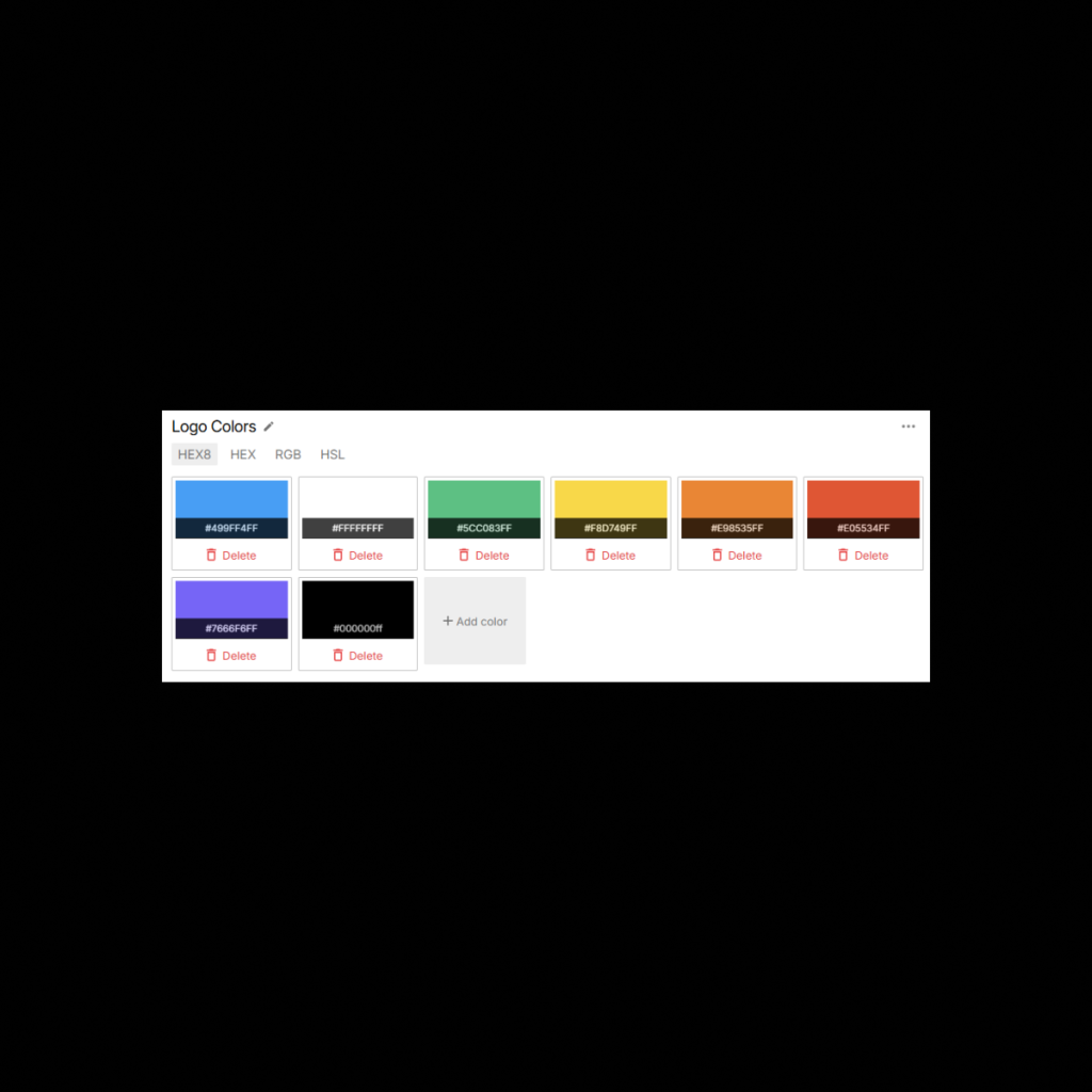
Logo Component Block
The Logo Component Block in UI Vault connects directly to your Figma file, pulling in…
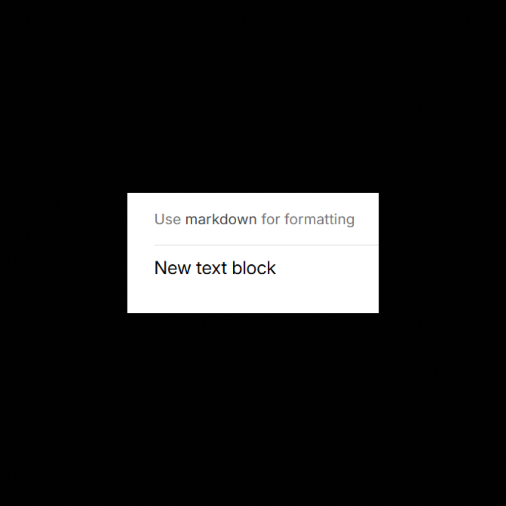
Documentation Block
The Markdown Text Block in UI Vault gives you the power to write and format…
Component Block
The Component Block in UI Vault allows you to pull in Figma components directly into…
Icon Component Block
UI Vault’s Icon Component Block allows you to sync icon sets from Figma and display…