

Frames Block
The Frames Block allows you to embed and display Figma frames directly inside your UI…
Design Tokens Block
The Design Tokens Block allows you to organize and display your system’s foundational design decisions—colors,…
Prototype Block
The Prototype Block lets you embed interactive Figma prototypes inside your UI Vault style guide—bringing…
Spacing & Grid Block
The Spacing & Grid Block in UI Vault allows teams to document and display spacing…
Border & Radius Block
The Border & Radius Block in UI Vault allows teams to visually document Figma’s border…
Variables Block
The Variables Block in UI Vault brings your Figma Variables into a structured, visual format—making…
Icon Component Block
UI Vault’s Icon Component Block allows you to sync icon sets from Figma and display…
Component Block
The Component Block in UI Vault allows you to pull in Figma components directly into…
SEO-Friendly Style Guides
UI Vault enables you to publish fully indexable, SEO-optimized style guides with structured metadata, clean…
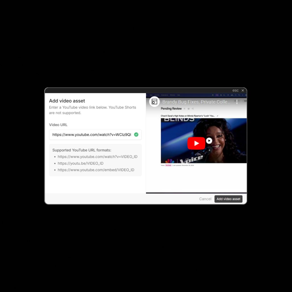
Link Previews
UI Vault’s Embedded Link Previews transform plain URLs into rich, visual cards directly inside your…
Custom Navigation
With Custom Top Bar Navigation, UI Vault allows you to configure your style guide’s primary…
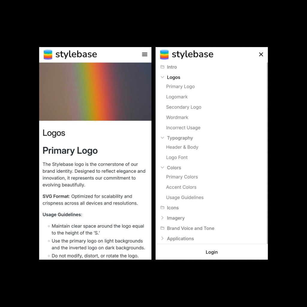
Mobile Layout
UI Vault’s Mobile Layout ensures that your entire style guide experience is fully responsive and…
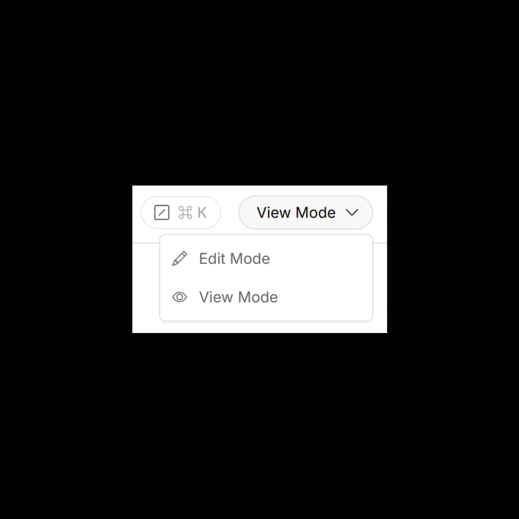
View Mode
View Mode is UI Vault’s default reading experience—crafted to make your style guide feel clear,…
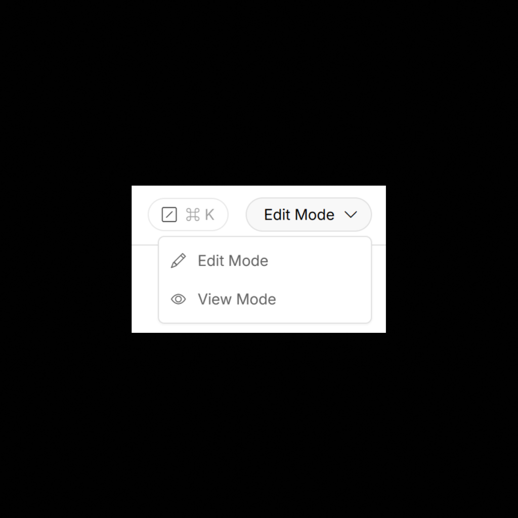
Edit Mode
Edit Mode in UI Vault empowers your team to update and manage design system documentation…
Custom Layouts
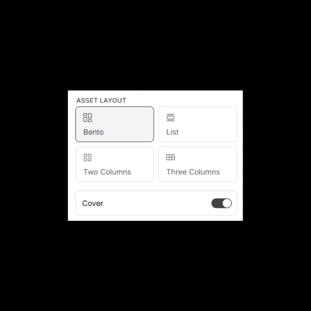
UI Vault’s Custom Layouts give you complete control over how your style guide content is…
Flipbook Navigation
With Flipbook Navigation, UI Vault transforms your style guide into a linear, storybook-style journey—allowing users…
Coverpage
The Cover Page is the front door to your style guide—a fully customizable landing screen…
Collections Banner
The Collections Banner allows you to add a custom header section at the top of…
White Glove Setup
With White Glove Setup, UI Vault’s team of product and design system specialists will personally…
Table of Contents
Brandy’s Table of Contents feature automatically generates a clear, structured overview of your brand spaces…
Documentation Block
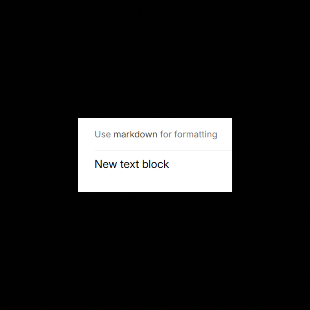
The Markdown Text Block in UI Vault gives you the power to write and format…

File Previews
Brandy’s File Previews feature allows you to preview uploaded files directly within your brand space,…

Keyboard Shortcuts
UI Vault is built for designers and developers who move fast. With global and context-aware…

Logo Component Block
The Logo Component Block in UI Vault connects directly to your Figma file, pulling in…
Advanced Permissions
UI Vault’s Advanced Permissions system gives you total control over who can view, edit, manage,…
Private Collections
With Private Collections, UI Vault allows you to restrict visibility and access to specific collections…
Design System Collaboration
UI Vault turns your style guide into a living workspace for designers, developers, and product…
Style Guide Analytics
UI Vault’s Style Guide Analytics provides deep insights into how your design system is being…
Subcollections
As design systems scale, so does complexity. With Subcollections, UI Vault allows you to nest…
Bento Layouts
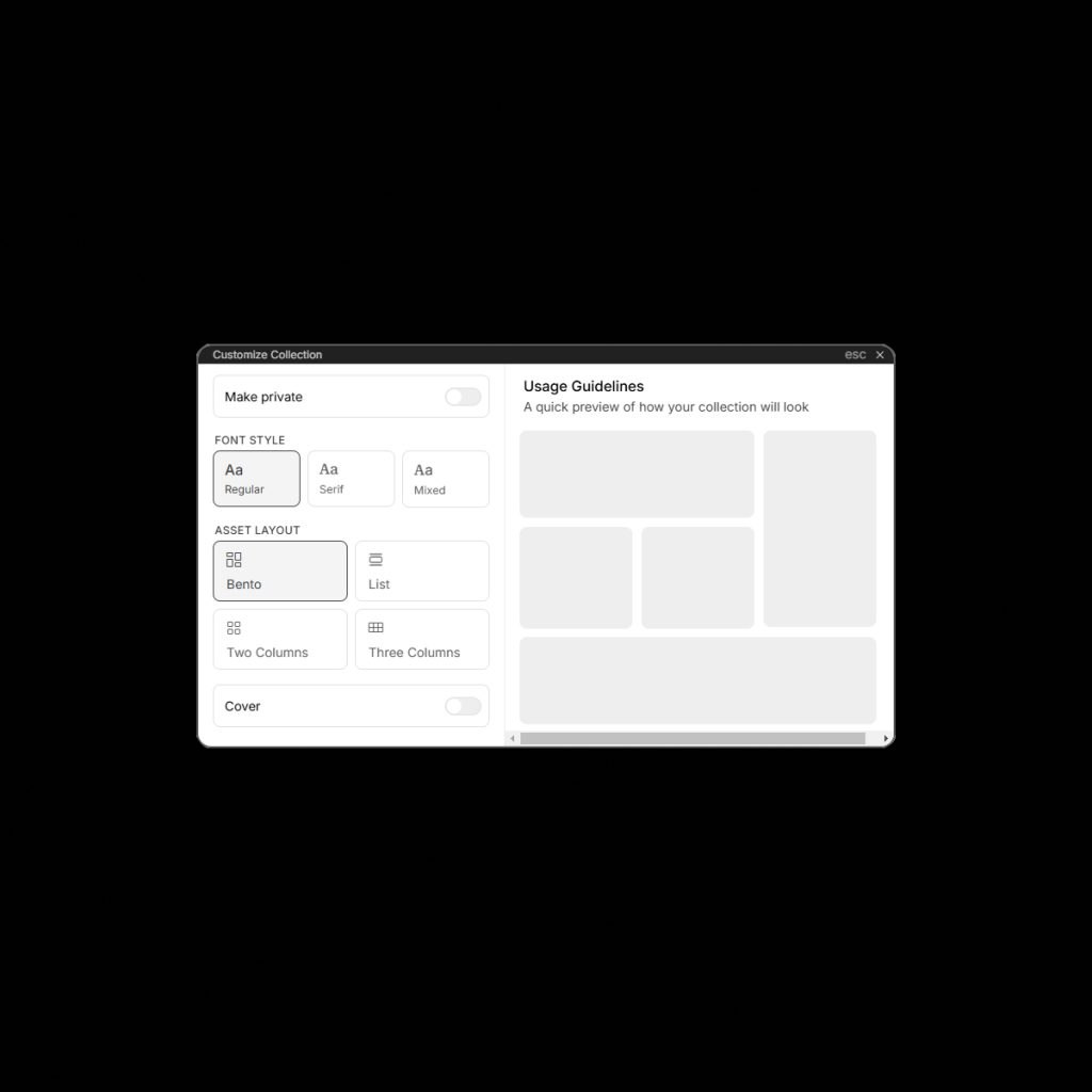
With Bento Layouts, UI Vault empowers you to arrange your style guide in flexible, card-based…
White Label
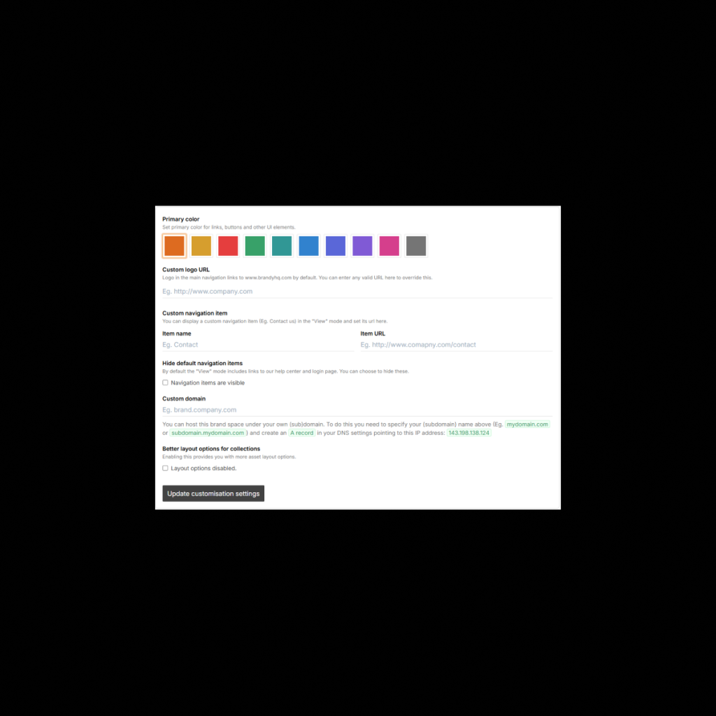
Elevate your brand experience with UI Vault’s White Label Suite—a comprehensive customization layer that lets…
Custom Branding
UI Vault allows you to fully brand your style guide portal with your own logo,…
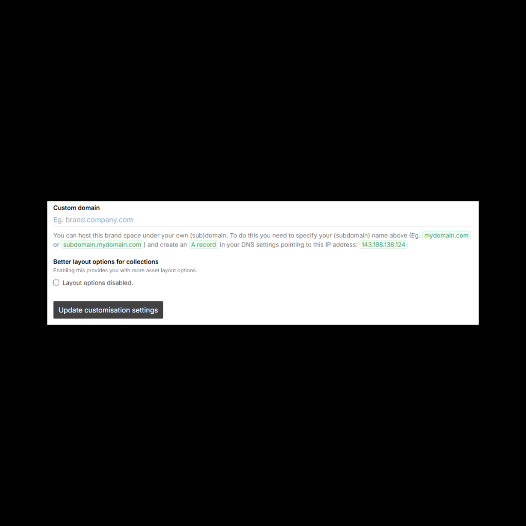
Custom URL
UI Vault allows you to set a custom domain for each of your style guides,…
Design System Versioning
UI Vault’s Versioning & Changelog feature allows you to track every update to your design…
Multi-Style Guides
UI Vault’s Multi Style Guides feature empowers teams to manage multiple Figma files, brands, and…
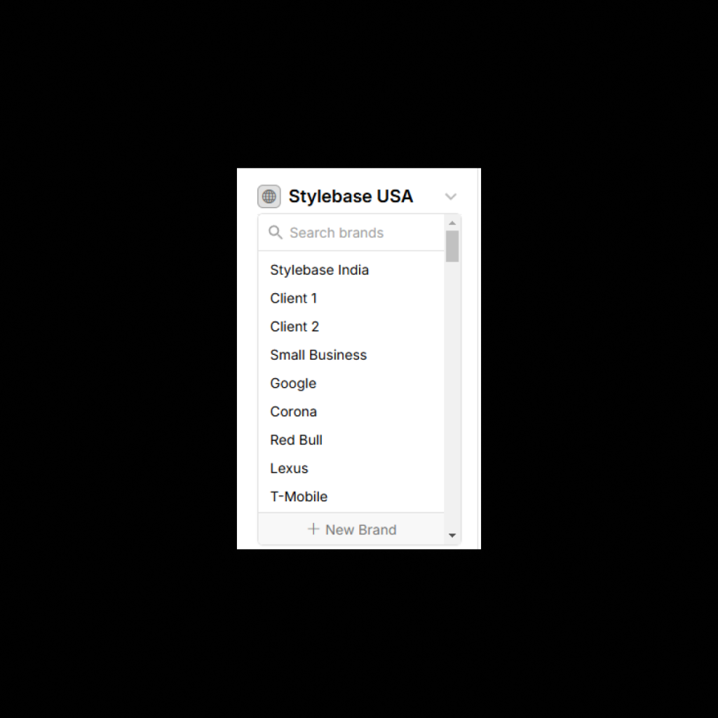
Style Guides
Turn your Figma styles, typography, color palettes, and components into a structured, interactive style guide…
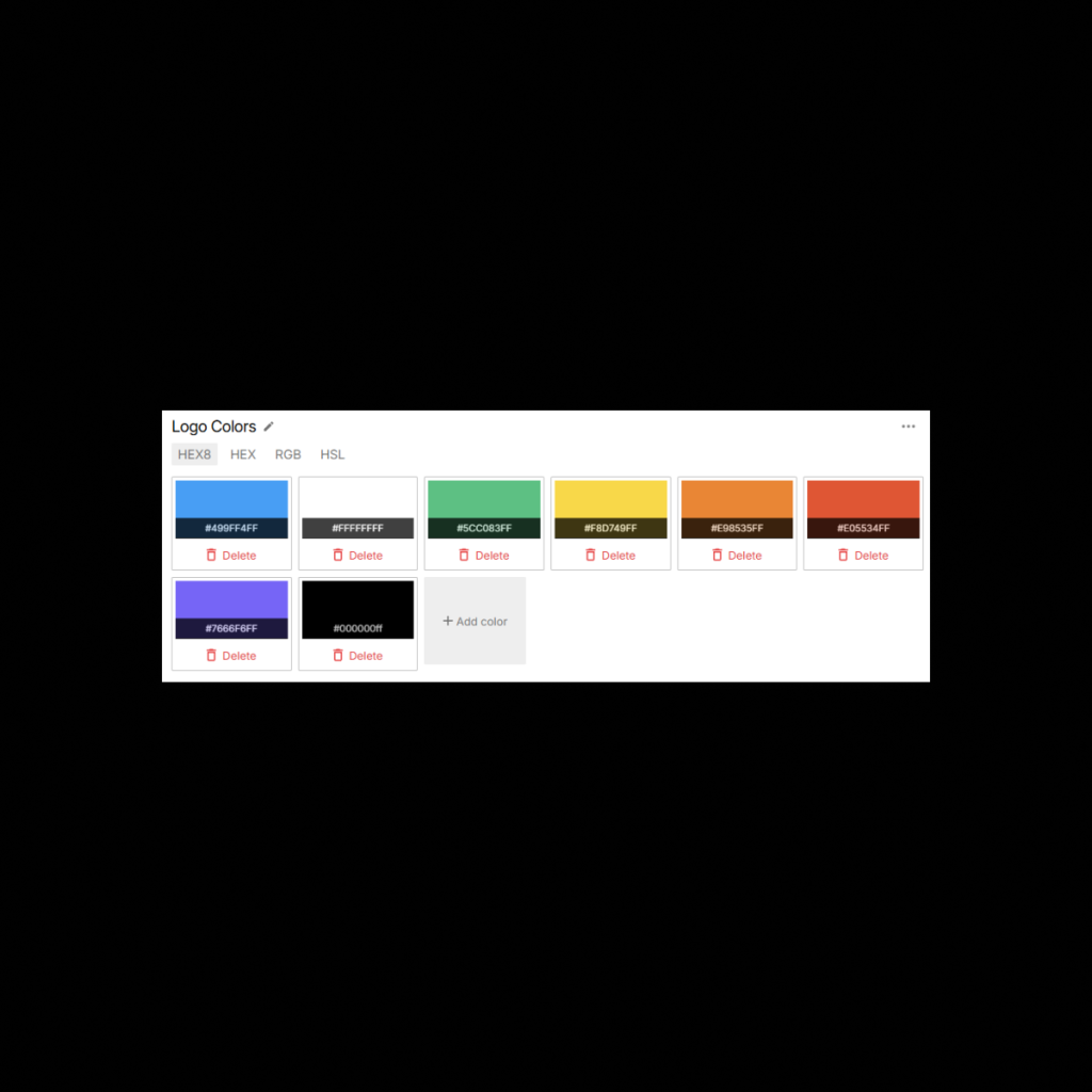
Color Styles Block
UI Vault seamlessly imports color styles from Figma, converting them into organized, interactive color blocks…

Text Styles Block
UI Vault automatically pulls Figma text styles into your typography documentation, displaying them in a…
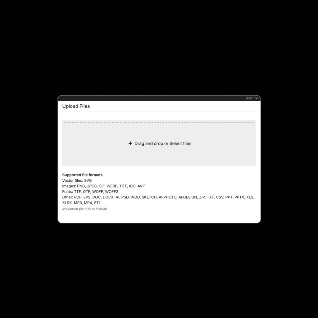
30+ Supported File Formats
UI Vault is built to handle the diverse nature of modern design work. With support…
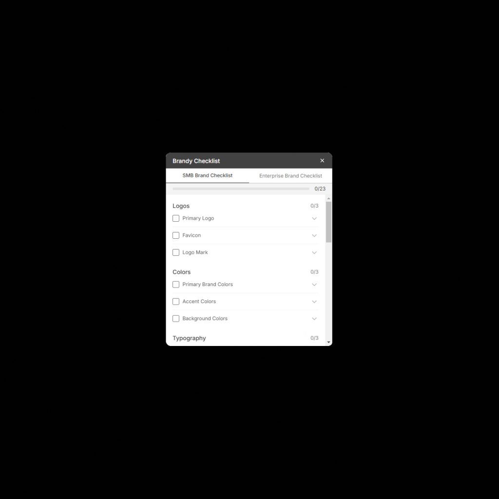
Design System Checklist
Ensure every aspect of your design system is properly documented, reviewed, and implemented with UI…
Smart Exports
UI Vault’s Smart Exports gives you the power to download structured design documentation, style guides,…
Component Tagging
Take control of your Figma components, design tokens, and UI elements with Component Tagging in…
Style Guide Search
Quickly locate components, styles, typography, colors, and design tokens with Style Guide Search in UI…
Metadata
Bring structure and searchability to your design system with Metadata in UI Vault. Assign custom…
Shareable Style Guide Link
Effortlessly share your live, interactive style guide with team members, developers, and stakeholders using a…
Collections
Group and structure your Figma components, styles, and assets with Collections in UI Vault. Keep…
Design Collaboration
Bridge the gap between designers, developers, and stakeholders with real-time, collaborative design system documentation. UI…
Design Connect Block
Sync and document your Figma design system seamlessly with UI Vault. Our cloud-based platform transforms…