


A design system sounds like a big, abstract thing until you actually have to build or maintain one. Then the question becomes very real and very practical. What exactly should go into it? What is essential and what is just nice to have?
Teams often start with good intentions and end up with a messy folder of components, half written guidelines, and outdated Figma files. Others mistake a style guide for a full design system and wonder why developers still feel confused. This guide exists to clear that up.
In this post, we will break down what a design system actually includes, how the different pieces work together, and where teams should document everything so it scales. This is not about creating something impressive on paper. It is about building a system that real designers and developers actually use.
A design system is not just a pretty reference. It is a shared source of truth for how products are designed, built, and maintained. When done right, it speeds up work, reduces inconsistency, improves accessibility, and helps teams stay aligned as products grow.
What Is a Design System Really?
Before listing components, it helps to understand what a design system is meant to do.
A design system is a living system of rules, assets, and guidance that helps teams design and build consistent user interfaces across products and platforms. It connects design and development, aligns teams, and removes guesswork from everyday decisions.
It is not a static document and it is not owned by one role alone. Designers, developers, and product teams all rely on it in different ways.
Design System vs Style Guide
A style guide focuses on visual rules. Colors, typography, spacing, logo usage, and sometimes tone of voice. It answers the question of how things should look.
A design system goes much further. It includes the style guide, but also design tokens, reusable components, usage guidelines, accessibility rules, and the processes that keep everything updated. A style guide is one piece of the system, not the system itself.
Design System vs Component Library
A component library is a collection of reusable UI elements like buttons, inputs, and modals. It is an important part of a design system, but on its own it lacks context.
Without documentation, principles, and tokens, a component library becomes hard to use correctly. Teams might reuse components but still apply them inconsistently. A design system gives components meaning, rules, and structure.
Why Teams Invest in Design Systems?
Teams invest in design systems to move faster without breaking consistency. Instead of redesigning the same patterns repeatedly, teams reuse proven solutions. Instead of debating spacing or colors, they rely on shared rules. Over time, this reduces friction, improves quality, and makes products feel more cohesive.
What a Design System Includes: The Core Building Blocks
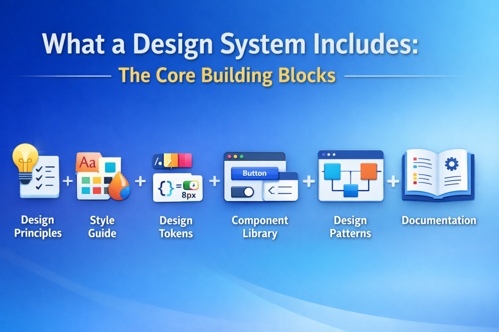
A good design system is made up of several connected parts. Each part solves a specific problem, but none of them work well in isolation. Together, they create a system that teams can trust.
Design Principles
Design principles are short statements that guide decisions. They explain the intent behind the system, not just the rules.
Good principles help teams answer questions like should we add another option here or simplify the flow. They keep decisions consistent even when the system does not yet have a component or pattern for a specific case.
Effective principles are clear, opinionated, and actionable. They focus on accessibility, clarity, performance, and reducing cognitive load, serving as practical guardrails that guide everyday work rather than marketing slogans.
Style Guide Foundations
The style guide defines the visual language of the product. This includes typography, color systems, spacing, iconography, and motion basics.
Typography guidelines explain which fonts to use, how to scale text, and how hierarchy works. Color systems define primary, secondary, and semantic colors such as success or error states. Spacing rules ensure layouts feel consistent and balanced across screens.
A good style guide focuses on systems, not individual values. Instead of listing random colors or sizes, it explains how to use them together. This makes it easier for teams to apply styles correctly and adapt them when the product evolves.
Design Tokens
Design tokens are the backbone of a scalable design system. They store the raw values that define visual decisions, such as colors, font sizes, spacing units, border radii, and motion values.
Instead of hard coding values everywhere, teams reference tokens like primary color or spacing small. These tokens can be shared across design tools and codebases, ensuring design and development stay in sync.
Tokens make changes safer and faster. When a value needs to be updated, it changes in one place and flows everywhere. This reduces errors and helps teams maintain consistency across platforms.
Component Library
The component library contains the reusable building blocks of the interface. Buttons, inputs, checkboxes, dropdowns, navigation elements, modals, and feedback components all live here.
Each component should include clear definitions of states, variations, and usage rules. For example, when to use a primary button versus a secondary one, or how an input behaves in error states.
A strong component library includes both design assets and production ready code. Designers and developers should be working from the same source, not parallel versions that drift apart over time.
Design Patterns
Design patterns are higher level solutions built from components. They solve common user experience problems, not just visual ones.
Examples include form layouts, onboarding flows, navigation structures, and empty states. Patterns help teams avoid reinventing flows that users already understand.
By documenting patterns, teams reduce inconsistency and speed up decision making. Instead of debating how to design a checkout flow or settings page, they start from a shared baseline and improve from there.
Design System Documentation
Documentation is where everything comes together. It explains how and when to use tokens, components, and patterns in real situations.
Good documentation answers practical questions. When should I use this component? What accessibility rules apply? What options are available? How do I customize it safely?
Documentation should be easy to navigate and kept up to date. It is not just for onboarding new team members. It is a daily reference for experienced designers and developers who want clarity and confidence.
How a Design System Is Structured?
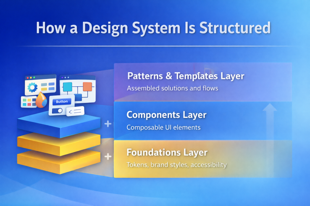
Once the core building blocks are in place, structure determines whether the system stays usable or slowly falls apart. A clear structure helps teams understand where things live, how they relate to each other, and how the system grows over time.
Most scalable design systems follow a simple layered approach. This keeps complexity manageable and reduces confusion as new components and patterns are added.
Foundations Layer
The foundations layer sits at the base of the system. This is where design tokens, brand styles, and accessibility primitives live.
Tokens define colors, typography scales, spacing units, motion values, and other core decisions. Brand styles explain how those tokens express the product identity. Accessibility foundations set minimum contrast ratios, focus behavior, and interaction rules.
When foundations are stable and well documented, teams can build confidently on top of them without second guessing basic decisions.
Components Layer
The components layer contains the reusable UI elements teams interact with most often. Buttons, inputs, cards, alerts, navigation items, and other interface building blocks belong here.
Components should be small, composable, and opinionated enough to guide correct usage. Each component should clearly explain its purpose, supported variations, states, and accessibility considerations.
This layer benefits the most from strong versioning and change logs. When components evolve, teams need to understand what changed and why.
Patterns and Templates Layer
Patterns and templates sit at the top of the structure. They combine components to solve real user experience problems.
Examples include page layouts, form flows, onboarding sequences, dashboards, and common content structures. This layer helps teams move faster by starting from proven solutions rather than blank canvases.
By mapping patterns back to components and foundations, the system stays connected instead of turning into disconnected examples.
DesignOps: The System Behind the System
A design system does not maintain itself. DesignOps is the set of people, processes, and tools that keep the system healthy over time.
This includes defining who can contribute, how changes are reviewed, and how updates are released. Without these rules, even the best designed systems slowly decay.
Good DesignOps practices make contribution safe and predictable. Teams know how to propose new components, improve existing ones, or suggest changes to tokens. Reviews focus on quality and consistency instead of personal preference.
Versioning is another key responsibility. Teams need clarity on what changed, what is breaking, and how to migrate. Clear release notes and update guidance build trust and encourage adoption.
DesignOps also helps balance stability with evolution. The goal is not to freeze the system, but to improve it without disrupting teams who rely on it every day.
What a Design System Does Not Include?
Defining boundaries is just as important as defining contents. When teams are unclear about what belongs in the design system, scope creep follows.
A design system does not include product roadmaps or feature prioritization. Those decisions belong to product teams. The system helps teams execute decisions, not make them.
It also does not replace full brand strategy. While the system ensures UI consistency, long term brand positioning, campaigns, and messaging live elsewhere.
One off or experimental components should not enter the core system too early. Temporary features and experiments belong in product repositories until they prove reusable.
Backend logic and API contracts are outside the scope of a design system. The system defines interface behavior, not server side rules.
Finally, a design system should not act as rigid law. It provides guardrails, not handcuffs. Teams should still prototype, explore new ideas, and feed successful experiments back into the system when they mature.
How to Decide What to Include First?
When starting or refining a design system, the best approach is to focus on reuse, not ambition.
Begin with design tokens and the handful of components that appear across most screens. Buttons, inputs, typography, spacing, and basic layout patterns usually deliver the highest return early on.
Document these thoroughly and ship them in both design and code. Once teams trust the system for everyday work, expand gradually.
Avoid building components or patterns for hypothetical future needs. Let real usage guide what gets added next. This keeps the system relevant and prevents it from becoming bloated.
Focus on Usefulness Not Completeness
The biggest mistake teams make is trying to build a perfect design system from day one. Usefulness matters more than completeness.
A design system becomes valuable the moment people actually use it. That usually starts with a small set of well documented tokens and components that solve real problems.
As teams adopt the system, it grows naturally. Patterns emerge. Gaps become visible. Improvements feel necessary rather than forced.
When a design system stays clear, practical, and easy to contribute to, it stops being a project and becomes part of how products are built every day.
That is when it delivers real value.
FAQs About Design System Contents
No. A style guide covers visual rules like colors and typography. A design system includes style guides plus tokens, components, patterns, documentation, and the processes that keep everything aligned.
A component belongs in the system when it is reused across multiple areas of the product and follows shared rules. If it solves a common problem and benefits from standardization, it is a good candidate.
Scalable design systems rely on stable tokens, small composable components, and clear governance. This allows teams to adapt patterns locally without breaking consistency across products.