
Every design team wants one thing above all: consistency. When multiple designers and developers collaborate on the same project, keeping every color, font, and element aligned can quickly become complex. This is where the concept of design system vs style guide becomes important. Both serve as essential tools for maintaining harmony across projects, but their roles and depth are quite different.
A style guide works as a visual and verbal reference for your brand. It defines how your logo should appear, which colors represent your identity, and how your tone of voice communicates your brand values. It ensures that every visual and written piece reflects the same personality, no matter who creates it.
A design system, on the other hand, brings structure to the entire design and development process. It provides reusable components, design tokens, and documented patterns that help teams create digital products faster and more consistently.
Platforms like UIvault allow teams to manage multiple Figma style guides under one system, transforming scattered design resources into unified, scalable workflows. By the end of this guide, you will learn how design systems and style guides differ, how they connect, and how to choose the right structure for your team.
What a Style Guide Really Does
A style guide acts as the foundation of your brand identity. It is a detailed document that defines how your brand should appear and communicate across every touchpoint. From logo placement and color palette to typography, imagery, and tone of voice, it serves as the reference manual that ensures visual consistency and clarity.
For many teams, a style guide is the first step toward design organization. It provides clear rules for designers, writers, and marketers to follow, helping them create a cohesive look and feel in everything they produce. Whether you are designing a web page, social post, or presentation, the style guide ensures that your brand feels familiar and professional.
A well-crafted style guide also simplifies collaboration. When everyone knows the exact colors, fonts, and logo variations to use, creative output becomes faster and more consistent. It eliminates guesswork and reduces the time spent revising visuals or messaging.
In modern design workflows, a style guide focuses on visual and verbal alignment. It sets the tone for your brand personality while maintaining visual order across all digital and printed materials. Tools like UIvault help teams store and share these visual elements directly from Figma, ensuring that every update stays synchronized across projects.
What a Design System Delivers
A design system is a structured ecosystem that connects creativity with functionality.It is much more than a visual guideline. It is a practical framework that allows designers and developers to work together efficiently. Within a design system, you will find reusable components, design tokens, and documented interaction patterns that guide how digital products are created and maintained.
The main strength of a design system lies in its ability to scale. When design and development teams collaborate across multiple products, it ensures that every button, layout, and component looks and behaves consistently. Instead of recreating elements from scratch, teams can rely on ready-to-use building blocks that save time and reduce errors.
A design system also defines the logic behind each component. For instance, it may explain how spacing works, how color contrast improves accessibility, or how interactions should respond to user input. This combination of design principles and code snippets helps teams create digital experiences that are cohesive and intuitive.
With UIvault, design systems become even more powerful. The platform allows teams to manage multiple Figma style guides, unify brand assets, and share reusable component libraries with ease. This ensures that every designer, developer, and stakeholder works with the same visual language, strengthening both efficiency and brand consistency.
Design System vs Style Guide: Key Differences
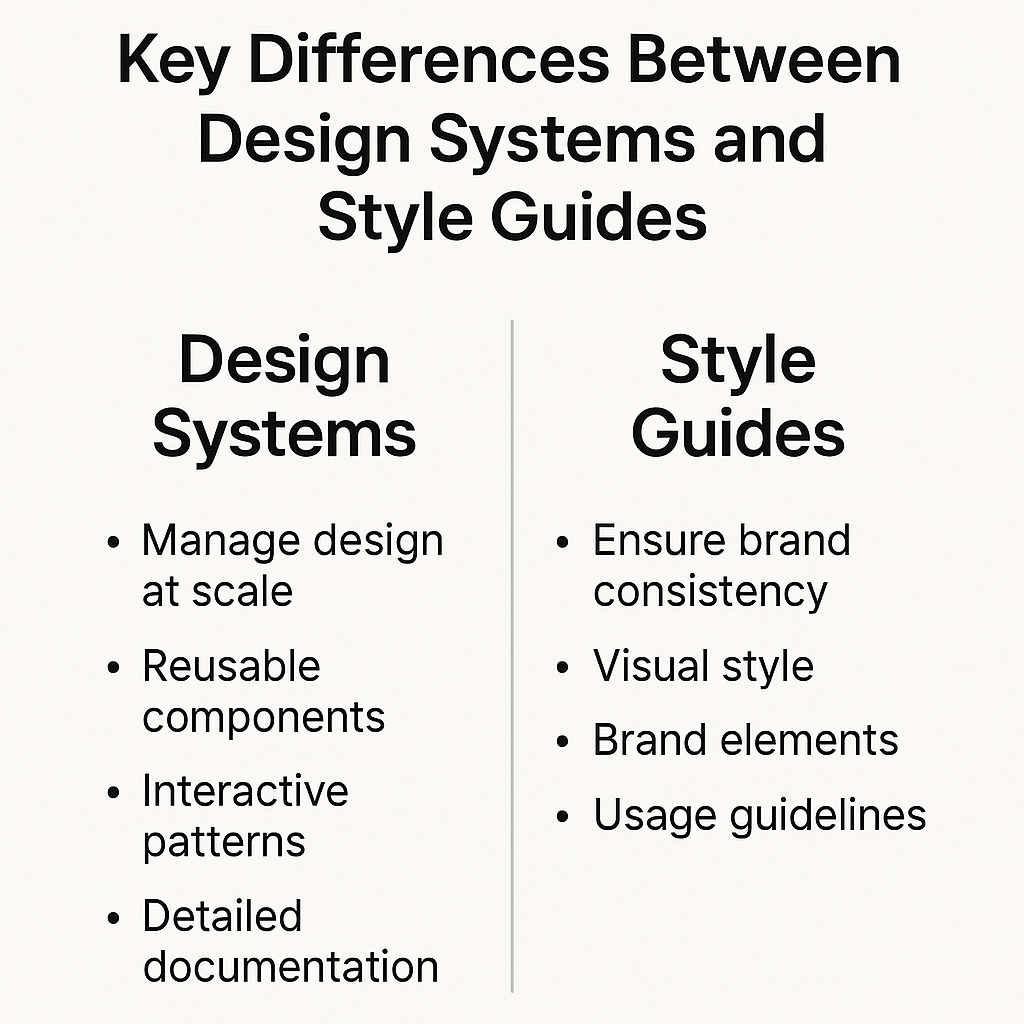
Design systems and style guides share the same goal of ensuring brand and design consistency, yet they function very differently. Knowing what separates them helps teams choose the right structure for their workflow and product goals.
Scope and Focus
A style guide defines how a brand should look and sound. It focuses on visual design and written communication, covering logo usage, color palette, typography, imagery, and tone of voice. It serves marketing, design, and content teams that want to preserve a unified brand identity.
A design system, in contrast, manages both design and development. It includes UI components, design patterns, and coded elements that shape digital products. Its scope extends beyond branding into functionality, accessibility, and interaction.
Purpose and Use
Style guides are used to maintain brand identity across campaigns and communication channels. They ensure that visual and verbal elements stay true to brand values.
Design systems support the entire product lifecycle. They help product teams build user interfaces quickly and consistently through reusable components. This makes them ideal for organizations managing multiple products or digital experiences.
Maintenance and Flexibility
A style guide is often static, updated only during a rebrand or design refresh. A design system is dynamic and evolves with the product. As teams build new features, they introduce new components, update design tokens, and refine documentation.
In short, a style guide defines the brand, while a design system builds the product. Together, they form a unified foundation that connects visual identity with functional design.
When to Use Each: Design System vs Style Guide
Both design systems and style guides bring value to teams, but the right choice depends on your goals, team size, and the complexity of your projects. Knowing when to rely on each helps you build a smoother, more efficient design workflow.
When to Use a Style Guide
A style guide is best suited for small or growing teams that need to establish a strong brand identity before scaling their digital products. It helps maintain brand consistency across marketing materials, websites, and content creation.
If your main focus is on defining your visual style and written tone, a style guide will keep everything aligned. It ensures that every designer, marketer, and writer works from the same creative foundation. This makes it ideal for startups, creative agencies, or businesses that prioritize brand recognition over technical implementation.
When to Use a Design System
A design system becomes essential once your team begins managing multiple digital products or features. It enables cross-functional collaboration between designers and developers by providing a shared library of reusable components and design tokens.
Large teams benefit from the scalability and speed that design systems bring. They reduce duplication of effort, minimize inconsistencies, and help maintain a unified experience across all digital platforms.
Combining Both for Consistency
Many successful organizations start with a style guide and later evolve it into a design system. As the brand grows, visual rules expand into coded components and shared resources. Platforms like UIvault make this transition easier by allowing teams to organize multiple Figma style guides and transform them into a cohesive, scalable system.
How Style Guides Evolve into Design Systems
A style guide often marks the first step in creating a unified visual language, but as teams grow and products scale, it naturally expands into a full design system. This evolution happens when design rules turn into reusable, functional elements that connect design and development.
From Static Guidelines to Dynamic Systems
A traditional style guide is static. It documents how a brand should appear through logos, color palettes, typography, and tone. Over time, teams realize the need for a more dynamic solution that supports collaboration and product growth. That is where the design system begins. It takes the foundation laid by the style guide and builds on it with design tokens, UI components, and interactive documentation.
The Transition Process
The process begins with identifying recurring design patterns and converting them into shared Figma components. These components are then linked with documentation that explains their usage, accessibility, and behavior. Tools like UIvault allow teams to centralize these assets, manage multiple Figma style guides, and keep everything synchronized across projects.
The Outcome
The result is a living ecosystem where every designer and developer can access the same visual rules and functional components. It reduces design debt, accelerates development, and ensures every product reflects the same brand quality.
The move from a style guide to a design system is not just about technology. It is about creating a culture of collaboration, consistency, and continuous improvement within your design and development teams.
Benefits of Using Design System Software like UIVault
Managing design systems manually can become challenging as teams and projects grow. This is where dedicated tools like UIvault simplify everything by bringing structure, visibility, and scalability to your entire design workflow.
Centralized Design Management
UIvault allows teams to organize multiple Figma style guides in one place. Instead of juggling scattered files and outdated components, designers and developers can access a single, unified source of truth. This ensures every design decision is consistent across projects and departments.
Instant Sharing and Collaboration
One of the biggest strengths of UIVault is its ability to make collaboration effortless. Teams can instantly share style guide links or design system updates with stakeholders, developers, or clients. This eliminates confusion, reduces back-and-forth communication, and keeps everyone aligned in real time.
Scalable Design Systems
With UIVault, your design system can grow along with your brand. As new components, color tokens, or typography rules are added, they automatically sync across projects. This helps maintain brand consistency while saving hours of manual updates.
Increased Efficiency for Design and Development Teams
UIvault bridges the gap between design and development by providing reusable components and code-ready documentation. Product teams can build faster, avoid repetitive work, and deliver more consistent user experiences.
Reliable Governance and Consistency
By keeping brand assets, component libraries, and design tokens centralized, UIVault strengthens visual consistency and design governance. It ensures that every UI element and interaction pattern aligns with your brand’s principles and user expectations.
With UIVault, teams gain a strong framework for scaling design collaboration that transforms creativity into organized, repeatable, and high-performing systems.
Conclusion: Design System vs Style Guide
Understanding the difference between a design system and a style guide is the first step toward creating a truly consistent and scalable brand experience. While a style guide defines how your brand looks and sounds, a design system ensures that your product behaves and feels the same across every digital platform.
A style guide helps teams maintain visual harmony and brand consistency. It sets the standards for logos, colors, typography, and messaging so that everything your audience sees communicates one unified identity.
A design system takes that foundation and turns it into a practical structure for collaboration. It combines reusable components, design tokens, and interactive documentation that connect designers, developers, and product teams under one shared framework.
Using tools like UIvault, teams can take this one step further. They can manage multiple Figma style guides, organize brand assets, and maintain synchronized updates across every project. The result is a workflow where creativity and consistency work hand in hand, and where brands grow stronger through collaboration.
With a strong system in place, design no longer feels fragmented. It becomes an organized process that delivers better products faster and always stays in alignment with your brand’s vision.