
Design tokens might sound like another trendy term floating around design system conversations, but they exist for a very practical reason. As products grow, teams struggle with the same problems again and again. Colors drift slightly across screens. Spacing feels inconsistent. Developers hard code values that designers later want to change. Small visual updates turn into large time consuming cleanups.
Design tokens help teams avoid all of that.
They create a shared foundation where design decisions are defined once and reused everywhere. Instead of relying on memory, screenshots, or static style guides, teams rely on structured values that flow directly into real products. This post explains design tokens in plain English, why they matter so much for modern design systems, and how teams can start using them without turning everything upside down.
What Are Design Tokens Really
At their core, design tokens are a way to store the key visual decisions of a product in a reusable format. Colors, font sizes, spacing units, border radius values, shadow styles, and even animation timing can all be represented as tokens.
Instead of hard coding a color like #ff6b6b across multiple files, you define a token such as color primary once and reference it everywhere. That token becomes the source of truth for that decision.
The idea was formalized by Jina Anne while working on the Salesforce Lightning Design System. She described design tokens as named entities that store visual design attributes and replace hard coded values. That definition still holds today because it explains the real benefit. Tokens turn visual decisions into something both designers and developers can use without translation.
What makes tokens different from traditional design documentation is that they are machine readable. A style guide might say use this shade of blue for primary actions. A token actually contains the value and can be consumed directly by code. That is where the real power comes from.
Design Tokens vs Static Style Guides
Static style guides describe what the design should look like. Design tokens actively power how it looks.
A PDF or wiki page can tell someone which color to use, but it still relies on humans to interpret and apply it correctly. Tokens remove that interpretation step. Developers pull tokens directly into CSS, JavaScript, or platform specific styles. Designers use the same tokens inside their design tools.
This shared reference eliminates ambiguity. There is no guessing which blue is correct or whether a margin should be eight or ten pixels. The token already defines it.
Why Design Tokens Matter for Growing Teams
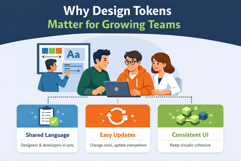
Design systems succeed or fail based on consistency and adoption. Tokens support both.
As teams grow, more people touch the interface. New developers join. Designers work on parallel features. Product managers request quick visual tweaks. Without a shared foundation, small inconsistencies creep in and multiply over time.
Design tokens act as a contract between design and development. They define what values are allowed and how they should be used. When everyone relies on the same tokens, the system scales more smoothly.
Tokens also make global changes dramatically easier. When a brand color changes or spacing needs refinement, teams update the token once instead of hunting through dozens of files. That saves time, reduces risk, and keeps releases predictable.
How Tokens Create a Shared Vocabulary
Tokens are most effective when they are named semantically. Instead of names like blue 500 or size 14, tokens describe intent. Examples include color danger, text primary, spacing small, or radius medium.
This naming approach helps everyone understand why a token exists and when it should be used. Designers choose tokens based on meaning rather than appearance. Developers implement features without second guessing which value is correct.
Over time, this shared vocabulary improves communication and reduces unnecessary back and forth.
Why One Token Change Can Update an Entire Product
One of the biggest advantages of design tokens is their cascading effect.
Imagine a product uses a token called color danger for alerts, error messages, and destructive buttons. If the team decides that the red feels too aggressive, they can adjust the token value once. Every component that references it updates automatically.
The same applies to spacing, typography, and shadows. Tokens turn large scale visual changes into controlled updates instead of risky refactors.
Real World Examples That Make Tokens Click
Consider a simple alert component. Without tokens, a developer might hard code a background color, text color, border radius, and padding. Multiply that across multiple components and screens, and the product quickly becomes fragile.
With tokens, each of those values references a shared decision. The alert background uses color danger background. The padding uses spacing medium. The radius uses radius small.
Now imagine a product manager wants alerts to feel calmer. Instead of redesigning every alert, the team adjusts the underlying token. The visual update happens everywhere with confidence.
Spacing tokens work the same way. Change a spacing scale token and the rhythm across the interface updates consistently. This level of control saves hours of review cycles and prevents accidental inconsistencies.
Where Design Tokens Sit Inside a Design System
In a basic design system structure, you typically have foundations, components, patterns, guidelines, and documentation. Design tokens sit at the very bottom of that stack.
They are the foundation that everything else builds on.
Components rely on tokens instead of raw values. Patterns reuse those components. Guidelines explain how to apply them correctly. When tokens are stable and well structured, the entire system behaves more predictably.
Tokens as the Foundation Layer
When components reference tokens instead of fixed values, they become more resilient. A button does not care what the exact color value is. It only cares that it uses the primary background token.
This separation makes components easier to maintain and reuse across platforms. Web, mobile, and other environments can share the same design intent even if the implementation details differ.
Starting Small With the Right Token Categories
Teams do not need to tokenize everything at once. Starting small is often the best approach.
Begin with core categories such as colors, typography sizes, spacing, border radius, and elevation. These values appear everywhere and deliver immediate benefits when centralized.
As the product matures, teams can introduce tokens for motion, breakpoints, iconography rules, and platform specific needs. Tokens should grow alongside the system, not ahead of it.
Semantic Naming: Why Intent Beats Appearance
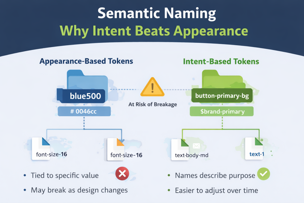
One of the most important decisions teams make when adopting tokens is how they name them.
Appearance based names like blue 500 or font size 16 lock teams into specific values. When the design changes, those names become misleading. Semantic names describe purpose instead of appearance.
Names like button primary background or text muted tell users when to use the token and why it exists. They make future changes easier because the meaning stays consistent even if the value changes.
Examples of Strong Semantic Token Names
Good token names are readable, consistent, and descriptive without being overly specific. They follow a clear structure that teams can learn and apply.
Strong naming reduces cognitive load and makes tokens approachable for people outside the design system core team.
Token Aliasing: How Flexibility Is Built In
As design systems mature, teams often discover that a single layer of tokens is not enough. This is where token aliasing becomes useful.
Aliasing means one token references another token instead of a raw value. Rather than tying components directly to a color value, you create layers that separate intent from implementation.
For example, you might define a base color token, then map that to a brand token, and finally reference that brand token inside a component token. Each layer has a clear responsibility.
This structure gives teams flexibility without chaos. You can change a brand decision or visual direction without rewriting every component that depends on it.
When Aliasing Helps
Aliasing is especially helpful for branding and theming.
If your product supports multiple brands or customer themes, aliasing allows you to swap values cleanly while preserving meaning. Components continue to reference tokens like button primary background while the underlying brand values change safely underneath.
Aliasing also helps during redesigns. Teams can introduce new visual directions gradually without breaking existing components.
When Aliasing Becomes a Problem
Aliasing becomes counterproductive when teams add too many layers without a clear reason.
If developers need to trace five or six token references to understand a single value, debugging becomes slow and frustrating. Tokens should add clarity, not obscure it.
A good rule is to introduce aliasing only when it solves a real problem. Keep layers intentional and well documented so everyone understands how values flow through the system.
Getting Started with Design Tokens Without Overwhelm
One of the biggest misconceptions about design tokens is that you need to do everything at once. That mindset often stops teams from starting at all.
Design tokens work best when introduced gradually.
You can begin by inventorying the styles you already use. Export colors, typography sizes, spacing values, and other repeated decisions from your design files. Patterns will emerge quickly.
From there, choose a simple format. Many teams start with JSON or CSS custom properties because they are easy to understand and widely supported. The format matters less than consistency and accessibility.
Naming is the next step. Focus on meaning instead of appearance. Choose names that describe purpose so people know when to use a token without looking up its value.
Finally, publish your tokens somewhere central. Tokens only work when people can find and trust them. A shared system is far more effective than values buried inside individual files.
Iteration is part of the process. Tokens evolve as your product and team grow. Refining names and structure over time is normal and healthy.
How Automation Keeps Tokens From Drifting
Manual processes break down as teams scale. Someone updates a design file. Someone else forgets to update code. Suddenly the design system no longer reflects reality.
Automation reduces this risk.
When tokens are synced between design tools and code repositories, teams spend less time copying values and more time building features. Automation also creates confidence. Everyone knows they are working from the same source of truth.
This alignment becomes increasingly important as products expand across platforms and teams. Automated token workflows help prevent silent inconsistencies that only show up late in development or after release.
Common Design Token Mistakes Teams Make
Design tokens solve many problems, but only when implemented thoughtfully. Certain mistakes appear again and again across teams.
One common issue is overly specific tokens. When names become too detailed, reuse suffers. Tokens should represent shared decisions, not edge cases.
Another problem is inconsistent naming. Without agreed conventions, tokens multiply with slight variations. This creates confusion and slows adoption. Naming rules should be defined early and reinforced through documentation.
Poor documentation is another major blocker. Tokens without context leave teams guessing. Each token should explain what it represents and when it should be used. Examples and usage guidance go a long way.
Finally, token drift can undermine trust. If design and code versions diverge, people stop relying on tokens altogether. This is why automation and clear ownership matter.
How to Measure If Design Tokens Are Actually Working
Design tokens are an investment, so it is reasonable to ask whether they are paying off.
The most telling signals are operational rather than cosmetic.
Teams often notice fewer visual inconsistencies in production. Small differences that once slipped through reviews become rare. Development speed improves because developers spend less time clarifying design details.
Communication also becomes smoother. Designers and developers refer to the same language instead of screenshots or hex values. The back and forth decreases.
Another strong indicator is how easily teams handle theming or brand updates. When these changes feel manageable instead of risky, tokens are doing their job.
Why Design Tokens Need Clear Documentation to Succeed
Even the best token system fails if people cannot understand or access it.
Documentation turns tokens from abstract values into usable tools. It explains why tokens exist, how they relate to each other, and where they should be applied. Without documentation, tokens become invisible or misused.
Good documentation shows examples, usage guidance, and relationships between tokens and components. It helps new team members onboard faster and gives existing teams confidence in their choices.
Documentation is not a one time effort. As tokens evolve, documentation should evolve with them. Keeping everything in sync reinforces trust in the system.
How UI Vault Helps Teams Manage Design Tokens at Scale
Managing design tokens across growing teams requires structure and visibility.
UI Vault provides a central space where design decisions live alongside documentation and style guidance. Tokens become easier to discover, understand, and apply consistently.
Instead of relying on scattered files or tribal knowledge, teams can reference a shared system that reflects current decisions. Designers, developers, and product teams stay aligned without constant manual coordination.
By bringing tokens, style guides, and documentation together, UI Vault supports the kind of design system maturity that tokens enable. The goal is not just storing values, but helping teams use them correctly every day.
Conclusion: Start Small Think Systematically
Design tokens unlock consistency, speed, and clearer collaboration, but they do not need to be perfect from day one.
Start with a small set of meaningful tokens. Name them for intent. Document them clearly. Let them grow alongside your system.
When tokens are treated as a shared foundation rather than an abstract concept, they begin to pay dividends. Teams move faster, visual quality improves, and design systems become easier to maintain over time.
The real value of design tokens is not technical elegance. It is the confidence they give teams to build, change, and scale without friction.